Choosing bright colours for your kitchen worktops is a great way to add energy and personality to your home. At Granite House, we believe that a vibrant kitchen can lift your spirits and enhance your space. Lets explore the benefits of using bright colours for kitchen worktops, popular colour choices, and tips on how to incorporate them into your kitchen design.
Benefits of Brightly Coloured Kitchens
1. Enhances Visual Appeal:
Brightly coloured worktops can instantly transform the look of your kitchen. They add a pop of colour that can make the space feel more lively and inviting. Whether you opt for a bold red or a cheerful yellow, these hues can create a focal point in your kitchen, drawing attention to the worktops and enhancing the overall design.
2. Reflects Personality and Style:
Your kitchen is a reflection of your personal style. Bright colours allow you to express your individuality and creativity. Whether you prefer a modern, sleek look with vibrant hues or a more traditional style with rich, saturated colours, there are endless possibilities to match your taste.
3. Boosts Mood and Energy:
Colours have a significant impact on our emotions and energy levels. Bright colours like yellow, orange, and green are known to uplift spirits and create a sense of happiness and vitality. By incorporating these colours into your kitchen worktops, you can create an environment that inspires positivity and creativity.
Popular Bright Colours for Kitchen Worktops
1. Red
Red is a colour of passion and energy. It can create a warm and inviting atmosphere in your kitchen. Red worktops pair beautifully with neutral cabinetry and stainless-steel appliances, adding a touch of drama and sophistication.

Pros:
- Passionate and Energetic: Red is known for its vibrant energy, making your kitchen feel lively and inviting.
- Dramatic and Sophisticated: Pairs well with neutral cabinetry and stainless-steel appliances for a sleek, modern look.
- Boosts Appetite: Studies show that red can stimulate appetite, making it a popular choice for dining spaces.
Cons:
- Overpowering: Red can be overwhelming if overused, so it’s best balanced with neutral tones.
- Limited Compatibility: May not complement all kitchen styles or colour schemes.
Works With:
- Neutral Cabinetry: White, beige, or grey cabinets to balance the intensity.
- Stainless-Steel Appliances: Enhances the modern and sophisticated feel.
- Dark Wood Accents: Adds warmth and richness to the overall design.
2. Yellow
Yellow is associated with happiness and sunshine. It’s a great choice for kitchens as it can make the space feel brighter and more spacious. Yellow worktops can complement both traditional and modern kitchen designs, adding a cheerful vibe.

Pros:
- Bright and Cheerful: Yellow is associated with happiness and can make your kitchen feel brighter and more spacious.
- Versatile: Complements both traditional and modern kitchen designs.
- Enhances Mood: Known to boost mood and energy levels, creating a positive environment.
Cons:
- High Maintenance: Can show stains and wear more easily than darker colours.
- Overstimulation: Too much yellow can be overstimulating and lead to visual fatigue.
Works With:
- White or Light Grey Cabinets: Enhances the brightness and airy feel.
- Natural Wood Elements: Complements the warmth and cheerfulness of yellow.
- Stainless-Steel or Black Appliances: Provides a sleek contrast.
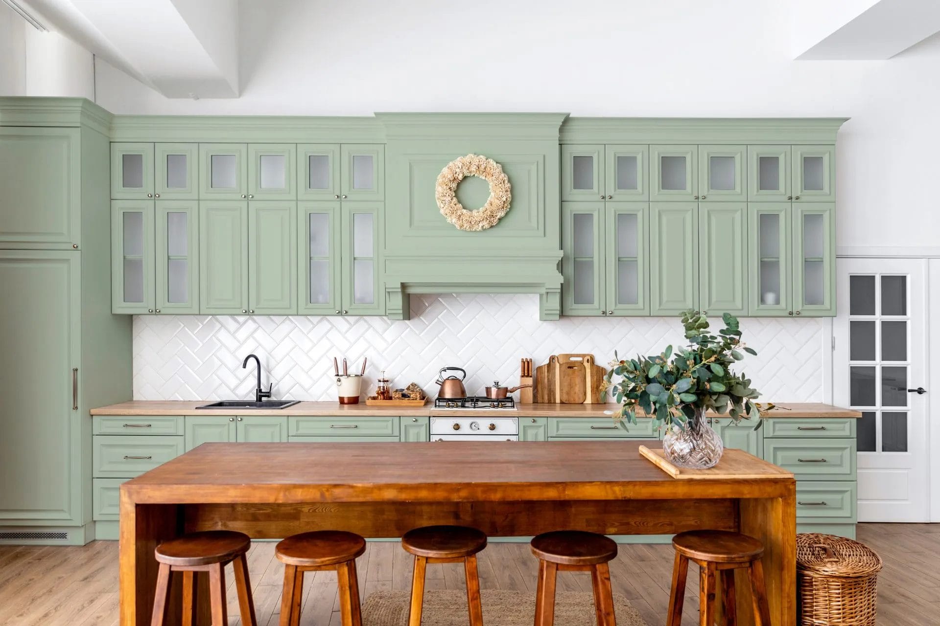
3. Green
Green represents nature and tranquillity. It’s an excellent choice for those who want to bring a touch of the outdoors into their kitchen. Green worktops can be paired with wooden elements and white cabinetry for a fresh and harmonious look.

Pros:
- Natural and Tranquil: Green represents nature and tranquillity, creating a calming atmosphere.
- Harmonious: Pairs well with wooden elements and white cabinetry for a balanced look.
- Refreshing: Brings a touch of the outdoors inside, enhancing the sense of freshness and cleanliness.
Cons:
- Seasonal: May feel less appropriate in certain seasons or climates.
- Trend Dependent: Popularity can fluctuate with design trends, potentially dating the kitchen.
Works With:
- White or Light Wood Cabinets: Complements the natural and refreshing vibe.
- Natural Stone or Wood Flooring: Enhances the connection to nature.
- Bronze or Copper Fixtures: Adds warmth and depth to the design.
4. Blue
Blue is a calming and soothing colour. It can create a serene and relaxing kitchen environment. Blue worktops work well with white or grey cabinets, adding a refreshing and coastal feel to the space.

Pros:
- Calming and Soothing: Blue is known for its calming effects, creating a serene kitchen environment.
- Versatile: Works well with white or grey cabinets, adding a coastal or modern feel.
- Timeless Appeal: Blue is a classic colour that doesn’t easily go out of style.
Cons:
- Cool Tone: May make the kitchen feel cooler, which could be a drawback in colder climates.
- Lighting Sensitive: Requires good lighting to avoid appearing too dark or muted.
Works With:
- White or Grey Cabinets: Provides a crisp, clean contrast.
- Natural Wood or Bamboo Flooring: Adds warmth and balances the coolness of blue.
- Chrome or Silver Fixtures: Enhances the modern, sleek aesthetic.
Tips for Incorporating Bright Colours into Your Kitchen
1. Start Small
If you’re hesitant about using bright colours, start with smaller areas. Consider using bright colours for the island worktop or a specific section of the kitchen. This allows you to test the waters without overwhelming the space.
2. Balance with Neutrals
To prevent the kitchen from looking too busy, balance bright worktops with neutral colours. White, grey, and beige cabinets or walls can create a perfect backdrop, allowing the bright worktops to stand out without clashing with other elements.
3. Coordinate with Accessories
Incorporate accessories and decor items that complement your brightly coloured worktops. Matching or contrasting kitchen utensils, rugs, and curtains can tie the look together, creating a cohesive and stylish design.
4. Consider Lighting
Lighting plays a crucial role in how colours appear. Ensure that your kitchen has adequate lighting to enhance the vibrancy of the worktops. Natural light is ideal, but well-placed artificial lighting can also work wonders.
Using bright colours for your kitchen worktops is a fantastic way to add personality, energy, and style to your home. At Granite House, we offer a wide range of colourful worktops that can cater to different tastes and preferences. Whether you choose a bold red, vibrant yellow, fresh green, or brilliant blue, our high-quality materials and expert craftsmanship will ensure that your kitchen is not only beautiful but also functional and durable. Explore our collection today and bring your kitchen to life with the perfect pop of colour.


